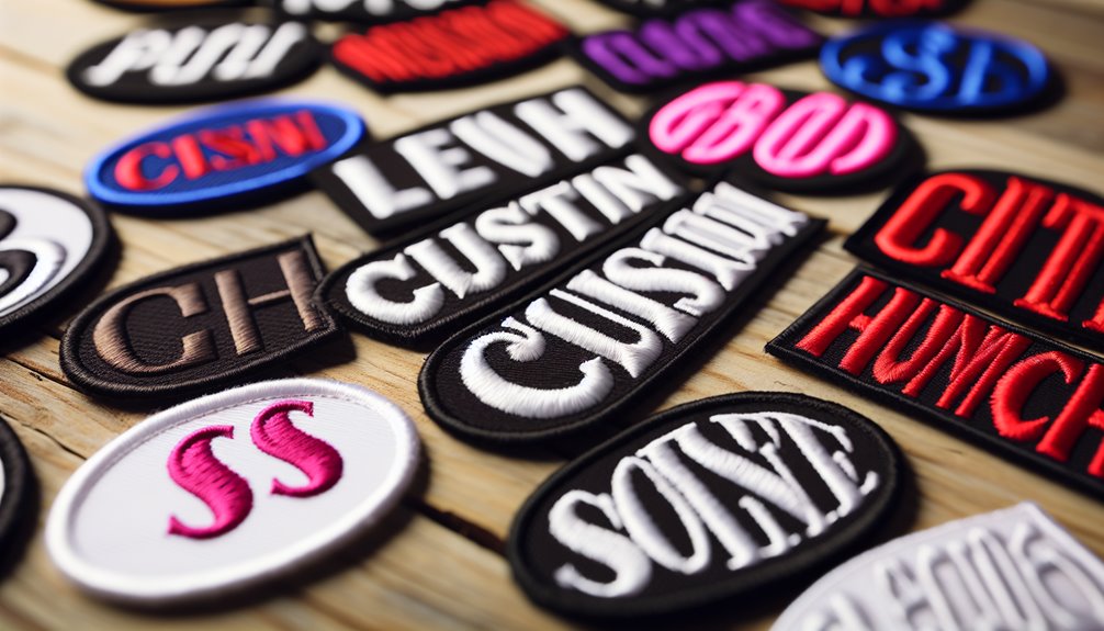
Selecting the ideal font for custom patch designs is essential for effective communication and visual impact. Serif fonts, like Times New Roman, offer classic appeal with their formal, elegant flair, suitable for traditional contexts. Sans serif fonts provide modern simplicity, enhancing readability and versatility across various design needs. Script fonts add sophistication, though they should be used sparingly to maintain clarity. Vintage fonts evoke nostalgia but require careful usage to guarantee readability. Bold fonts make strong statements but should be balanced to avoid overwhelming visuals. Each font choice can dramatically alter a patch’s message, inviting further exploration to perfect the design.
Serif Fonts for Classic Appeal
Serif fonts embody tradition and sophistication, making them an ideal choice for custom patch designs that aim to evoke a sense of classic appeal. These fonts are characterized by their distinct serifs or small lines attached to the end of a stroke in a letter or symbol, which lend an air of elegance and formality. Classic serif characteristics include a refined structure and a certain weightiness that can convey authority and heritage. Such attributes make serif fonts timeless font choices for projects where a connection to history or tradition is desired.
Fonts like Times New Roman, Garamond, and Baskerville are renowned for their ability to maintain clarity even in smaller sizes, which is vital for patches that may be viewed from a distance. Their balanced proportions and harmonious lines guarantee that the text remains legible and impactful.
Sans Serif for Modern Simplicity
While serif fonts offer a timeless connection to tradition, sans serif fonts present a clean, contemporary alternative for custom patch designs. These fonts are characterized by their lack of decorative strokes, providing a straightforward appearance. They work well with versatile designs. They are particularly effective in creating a modern, sleek look that appeals to a wide audience.
Consider the following benefits of using sans-serif fonts in custom patch designs:
Modern Aesthetics: Sans serif fonts deliver a fresh and streamlined look, perfectly aligning with the contemporary style that many brands aim for today.
Versatile Designs: These fonts are adaptable across various design elements, making them an excellent choice for patches used in diverse contexts, from corporate branding to casual apparel.
Readability: With their clear and simple structure, sans serif fonts enhance readability, especially when viewed from a distance or in smaller sizes, ensuring the message is communicated effectively.
Minimalist Appeal: Their uncluttered design caters to those who prefer a minimalist aesthetic, providing a subtle yet impactful visual statement.
Script Fonts for Elegant Touch
Infusing a sense of sophistication and charm into custom patch designs, script fonts offer an elegant touch that can elevate any project. These fonts, with their flowing and intricate characters, are reminiscent of handwritten elements that bring a personal and artistic flair to patches. Brush script styles, in particular, mimic the strokes of a paintbrush, providing a lively and dynamic quality that is both engaging and refined. In contrast, calligraphy styles evoke traditional penmanship with their elaborate and graceful lines, creating an aura of timeless elegance.
When incorporating script fonts into patch designs, it is essential to take into account readability. Due to their ornate nature, script fonts can sometimes become difficult to read if used excessively or in small sizes. Consequently, they are best employed for short phrases or as complementary elements within a design. Selecting the right script style can greatly impact the overall aesthetic, so it’s vital to choose one that aligns with the desired tone and message of the patch.
Vintage Fonts for Nostalgic Vibes
Vintage fonts infuse a sense of nostalgia and timeless appeal. These fonts draw from retro typography, creating nostalgic aesthetics that resonate deeply with audiences. When employed effectively, vintage fonts can transform a simple patch into a piece of art that tells a story. Here are a few considerations for using vintage fonts:
Historical Context: Understand the era your font is inspired by. Fonts from the 1920s differ considerably from those of the 1970s. This knowledge enhances the authenticity of your design.
Readability: While vintage fonts offer charm, make sure they remain legible. Complex lettering can obscure messages, detracting from the patch’s purpose.
Consistency: Align your font choice with the overall theme of your patch. Inconsistencies between font style and design elements can confuse the intended nostalgic message.
Balance: Use vintage fonts sparingly. Overuse can overwhelm a design, reducing its impact. Pair them with simpler elements to maintain focus.
Bold Fonts for Strong Statements
Building on the charm of vintage fonts, another powerful tool in custom patch design is the use of bold fonts to create strong, impactful statements. Bold fonts command attention, making them ideal for conveying impactful messaging. In the domain of custom patches, where space is limited, and clarity is paramount, bold fonts serve as a visual anchor, guaranteeing that the message is not only seen but remembered.
When choosing a bold font, it is vital to take into account how it aligns with your brand identity. Bold fonts can convey different emotions and tones, from the assertive confidence of a sans-serif typeface to the classic strength of serif options. The right bold font can flourish a patch from merely decorative to a key component of branding, reinforcing the values and personality of the organization it represents.
Handwritten Fonts for Personal Feel
Handwritten fonts introduce a personal and intimate touch to custom patch designs. They are not stored in digital devices but still are execution-able via scanning. They are ideal for projects aiming to evoke warmth and authenticity. These fonts can transform a simple design into a meaningful expression. Handwritten fonts create an emotional connection with the audience. When used thoughtfully, they can serve as a powerful tool for personal branding, conveying a message that is both unique and genuine.
To effectively incorporate handwritten fonts in your custom patch designs, consider the following strategies:
Choose the Right Style: Select a font that aligns with the message you wish to convey. A casual script can suggest informality and friendliness, while a more refined style might convey elegance and sophistication.
Maintain Readability: Confirm that the handwritten font remains legible, especially when scaled down to fit a patch. Clarity should never be sacrificed for style.
Balance with Other Elements: Pair handwritten fonts with simpler design elements to prevent visual clutter and maintain focus on the message.
Reinforce Your Brand: Use handwritten fonts consistently across various applications to strengthen personal branding and cultivate a recognizable identity.
Decorative Fonts for Unique Flair
Decorative fonts offer a distinctive flair to custom patch designs, providing an opportunity to infuse creativity and personality into your artwork. These fonts are perfect for those looking to incorporate artistic flair into their patches, making them stand out with unique and eye-catching styles. Unlike traditional fonts, decorative fonts often feature intricate details and playful designs that capture attention and convey a specific theme or mood.
Additionally, decorative fonts should complement the overall design elements and colors of your patch. Harmonizing the font with other visual aspects will create cohesion and enhance the overall impact of your design. By thoughtfully incorporating decorative fonts, your custom patches can achieve a unique flair that resonates with your intended audience.
Minimalist Fonts for a Clean Look
Embracing simplicity and elegance, minimalist fonts are ideal for custom patch designs that require a clean, streamlined look. These fonts bring a sense of sophistication.
Here are four key considerations for using minimalist fonts effectively in your custom patch designs:
Line Spacing: Adequate line spacing enhances readability, ensuring that each letter stands distinct and the text doesn’t appear crowded. This is fundamental for maintaining the minimalist appeal.
Font Pairing: Combining minimalist fonts with complementary styles can add variety without overwhelming the design. Choose fonts that balance each other, maintaining simplicity while enhancing visual interest.
Weight and Size: Select appropriate font weights and sizes to verify that the text is easily readable from a distance. This choice should align with the overall minimalist theme, avoiding excessively bold or ornate styles.
Color Contrast: Utilize high color contrast between the text and background to make the minimalist font stand out, ensuring the message is clear and impactful.
I'm a writer and embroidery enthusiast who is passionate about quality craftsmanship. I feel spiritual to share and review custom made products with a wider audience. I love writing SEO stuff for targeted market.
https://www.patchesmania.com/wp-content/uploads/2025/01/The_Best_Fonts_to_Use_in_Custom_Patch_Designs.jpg5751006Majidhttp://patchesmania.com/wp-content/uploads/2022/07/Patch-Mania-logo-2.pngMajid2025-01-28 00:20:462025-02-10 19:19:13The Best Fonts to Use in Custom Patch Designs
0replies
Leave a Reply
Want to join the discussion? Feel free to contribute!

Leave a Reply
Want to join the discussion?Feel free to contribute!