Everything about design, shape, colors and font of customized logos, patches and printing.

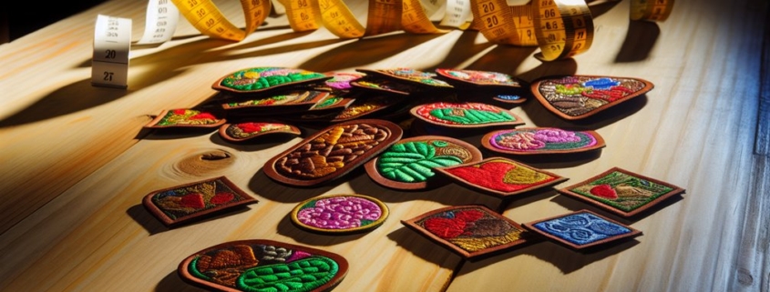
How to Create a Perfect Color Palette for Custom Patches

Creating the perfect color palette for custom patches begins with a solid grasp of color theory and its emotional impact. Start by defining the purpose and audience of your patch to align colors with the intended message. Consider psychological and cultural connotations and utilize digital tools to experiment with hues and test combinations. Also, accounting for fabric limitations and documented selections with precise color codes will aid in achieving consistent results.

Let’s explore further to uncover techniques for impeccable patch design.

Quick Overview

  • Understand the emotional impact and cultural significance of colors to align with your patch’s message and audience.
  • Define your patch’s purpose and target audience to guide color choices and ensure emotional resonance.
  • Balance current color trends with timeless hues for a modern yet enduring palette.
  • Use digital tools to experiment with color combinations and test their effectiveness through feedback and mock-ups.
  • Consider fabric limitations to ensure chosen colors remain vibrant and compatible with embroidery techniques.

Understanding Color Theory

Understanding color theory is vital for creating an effective color palette for custom patches. At the core are primary colors—red, blue, and yellow—serving as the foundation from which all other colors derive. Mastery of color harmony involves blending these hues to achieve a visually pleasing effect, often invoking an emotional impact that resonates with viewers. For instance, red might evoke passion or urgency, while blue often conveys calmness. This emotional impact is further influenced by cultural significance, as colors can carry different meanings across societies.

Color Psychology

Color psychology plays a key role in selecting hues that align with the intended message of a patch. It involves understanding how colors affect perception and behaviour, guaranteeing the palette chosen supports the patch’s purpose. Contrast techniques, such as pairing complementary colors, enhance legibility and focus, while saturation levels dictate vibrancy and subtlety. Remaining informed about current color trends guarantees that the design remains modern and appealing.

Incorporating these elements into the design process requires a delicate balance, yet it is essential to achieving a coherent and impactful custom patch. The thoughtful application of color theory transforms a simple design into a powerful communication tool.

Defining Patch Purpose

The initial step in creating a custom patch is to clearly define its purpose, as this serves as the foundation for all subsequent design decisions. Understanding the purpose guides guarantees that the patch effectively communicates the intended message. Patch symbolism plays a pivotal role in conveying meaning and connecting with the target audience. Whether the patch represents an organization, commemorates an event, or showcases personal identity, the symbolism must be considered with care.

Key Role of the Patch

To begin, identify the core message or theme you wish to express. Consider the patch’s role: Is it to promote unity, celebrate an achievement, or perhaps raise awareness? Each purpose necessitates different visual elements and symbols to resonate with the intended audience. For instance, a patch designed for a youth group may emphasize vibrant colors and playful motifs, whereas a military unit patch might focus on discipline and heritage.

Choosing a Color Scheme

Color is a powerful tool in the design of custom patches, serving as both an aesthetic element and a communicator of the patch’s purpose. Selecting a color scheme requires a thoughtful approach, as the hues chosen can evoke specific emotions and convey messages. Understanding color psychology is vital; for instance, blue often symbolizes trust and calmness, while red can represent passion or urgency. These associations can greatly impact how your patch is perceived and should align with its intended message or function.

Seasonal Trends

Seasonal trends also play a significant role in choosing a color scheme. Colors that are popular during certain times of the year can enhance the relevance and appeal of your patch. For example, warm tones like oranges and browns are typically associated with autumn, while pastels are favored in spring. By incorporating these trends, your patch can remain current and visually engaging.

Consider the longevity of the colors you select, aiming for a harmonious blend that will stand the test of time while still resonating with the intended audience.

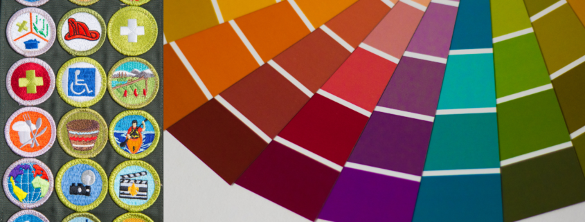
Using Digital Color Tools

Digital color tools offer designers an invaluable resource for crafting the perfect palette for custom patches. Utilizing these tools effectively can guarantee color harmony and branding consistency, essential aspects for any design. The color wheel is one such vital tool, helping designers understand relationships between colors and assisting in selecting complementary or analogous hues.

Digital Swatches

Digital swatches allow for easy experimentation with various shades, ensuring the chosen palette aligns with intended design themes and contrast levels. Luckily, Patches Mania offers its own digital file that we share with everyone joining our elite patch club. Our PDF file format helps you match the branding sheds of your logo to embroidering threads. Also, these hex codes afford the flexibility to tweak designs until the perfect balance is achieved while we are printing stickers, dye-sublimation or DTF transfers. Moreover, digital swatches aid designers in creating visually appealing and functional custom patches that communicate their message effectively.

To guarantee a cohesive and accessible design, consider the following:

  • Saturation adjustments: Modifying saturation levels can affect mood and visibility, making colors more vibrant or muted as needed.
  • Color accessibility: Evaluate how color combinations affect individuals with color vision deficiencies to enhance readability and inclusivity.
  • Branding consistency: Align colors with existing brand guidelines to maintain a unified identity across all platforms.

Considering Fabric Limitations

When designing custom patches, understanding fabric limitations is vital for guaranteeing the final product meets expectations. Different fabric types dictate the color palette choices due to their unique properties. For instance, twill and felt offer different texture influences, with twill allowing for sharper detail and felt providing a softer appearance. These textures affect how colors are perceived and should be carefully considered.

Colourfastness

Colourfastness considerations are important as well. Some fabrics may not hold dye as well as others, leading to fading over time. This directly impacts patch durability, particularly if the patches are exposed to sunlight or frequent washing. Understanding dye limitations can help in selecting colors that maintain their vibrancy.

Embroidering Compatibility

Embroidery compatibility is another factor influenced by fabric type. Heavier material weights, such as those found in denim or canvas, may limit the intricacy of designs that can be effectively embroidered. Conversely, lighter fabrics might not support the weight of a dense embroidery design, affecting the patch’s longevity.

Testing Color Combinations

When testing color combinations, consider the contrast balance to guarantee that your design is both eye-catching and legible. High contrast can make elements pop, but too much might feel overwhelming. Conversely, low contrast can make a design appear muted or hard to discern.

To effectively test color combinations, consider these strategies:

  • Create digital mock-ups: Use design software to preview how different colors interact before committing to a final choice.
  • Print samples: Testing on fabric can reveal how colors behave in real-world conditions, exposing any issues with contrast or vibrancy.
  • Seek feedback: Gather opinions from others to evaluate how well your chosen colors communicate the intended message.

Finalizing Color Palette

When finalizing your palette, consider the emotional impact that colors can evoke. Each hue carries its own psychological weight and can influence perceptions and emotions. For instance, blues often evoke calmness and trust, while reds may inspire energy and urgency. Understanding these associations allows you to choose colors that align with the intended message and purpose of your patch.

Light Test

It is essential to test your chosen palette under different lighting conditions and materials to ascertain its versatility and effectiveness. This step helps anticipate how colors will appear in real-world applications. By taking a thoughtful approach to finalize your color palette, you can create a patch that communicates the desired message effectively.

The Best Fonts to Use in Custom Patch Designs

Selecting the ideal font for custom patch designs is essential for effective communication and visual impact. Serif fonts, like Times New Roman, offer classic appeal with their formal, elegant flair, suitable for traditional contexts. Sans serif fonts provide modern simplicity, enhancing readability and versatility across various design needs. Script fonts add sophistication, though they should be used sparingly to maintain clarity. Vintage fonts evoke nostalgia but require careful usage to guarantee readability. Bold fonts make strong statements but should be balanced to avoid overwhelming visuals. Each font choice can dramatically alter a patch’s message, inviting further exploration to perfect the design.

Serif Fonts for Classic Appeal

Serif fonts embody tradition and sophistication, making them an ideal choice for custom patch designs that aim to evoke a sense of classic appeal. These fonts are characterized by their distinct serifs or small lines attached to the end of a stroke in a letter or symbol, which lend an air of elegance and formality. Classic serif characteristics include a refined structure and a certain weightiness that can convey authority and heritage. Such attributes make serif fonts timeless font choices for projects where a connection to history or tradition is desired.

Fonts like Times New Roman, Garamond, and Baskerville are renowned for their ability to maintain clarity even in smaller sizes, which is vital for patches that may be viewed from a distance. Their balanced proportions and harmonious lines guarantee that the text remains legible and impactful.

Sans Serif for Modern Simplicity

While serif fonts offer a timeless connection to tradition, sans serif fonts present a clean, contemporary alternative for custom patch designs. These fonts are characterized by their lack of decorative strokes, providing a straightforward appearance. They work well with versatile designs. They are particularly effective in creating a modern, sleek look that appeals to a wide audience.

Consider the following benefits of using sans-serif fonts in custom patch designs:

  1. Modern Aesthetics: Sans serif fonts deliver a fresh and streamlined look, perfectly aligning with the contemporary style that many brands aim for today.
  2. Versatile Designs: These fonts are adaptable across various design elements, making them an excellent choice for patches used in diverse contexts, from corporate branding to casual apparel.
  3. Readability: With their clear and simple structure, sans serif fonts enhance readability, especially when viewed from a distance or in smaller sizes, ensuring the message is communicated effectively.
  4. Minimalist Appeal: Their uncluttered design caters to those who prefer a minimalist aesthetic, providing a subtle yet impactful visual statement.

Script Fonts for Elegant Touch

Infusing a sense of sophistication and charm into custom patch designs, script fonts offer an elegant touch that can elevate any project. These fonts, with their flowing and intricate characters, are reminiscent of handwritten elements that bring a personal and artistic flair to patches. Brush script styles, in particular, mimic the strokes of a paintbrush, providing a lively and dynamic quality that is both engaging and refined. In contrast, calligraphy styles evoke traditional penmanship with their elaborate and graceful lines, creating an aura of timeless elegance.

When incorporating script fonts into patch designs, it is essential to take into account readability. Due to their ornate nature, script fonts can sometimes become difficult to read if used excessively or in small sizes. Consequently, they are best employed for short phrases or as complementary elements within a design. Selecting the right script style can greatly impact the overall aesthetic, so it’s vital to choose one that aligns with the desired tone and message of the patch.

Vintage Fonts for Nostalgic Vibes

Vintage fonts infuse a sense of nostalgia and timeless appeal. These fonts draw from retro typography, creating nostalgic aesthetics that resonate deeply with audiences. When employed effectively, vintage fonts can transform a simple patch into a piece of art that tells a story. Here are a few considerations for using vintage fonts:

  1. Historical Context: Understand the era your font is inspired by. Fonts from the 1920s differ considerably from those of the 1970s. This knowledge enhances the authenticity of your design.
  2. Readability: While vintage fonts offer charm, make sure they remain legible. Complex lettering can obscure messages, detracting from the patch’s purpose.
  3. Consistency: Align your font choice with the overall theme of your patch. Inconsistencies between font style and design elements can confuse the intended nostalgic message.
  4. Balance: Use vintage fonts sparingly. Overuse can overwhelm a design, reducing its impact. Pair them with simpler elements to maintain focus.

Bold Fonts for Strong Statements

Building on the charm of vintage fonts, another powerful tool in custom patch design is the use of bold fonts to create strong, impactful statements. Bold fonts command attention, making them ideal for conveying impactful messaging. In the domain of custom patches, where space is limited, and clarity is paramount, bold fonts serve as a visual anchor, guaranteeing that the message is not only seen but remembered.

When choosing a bold font, it is vital to take into account how it aligns with your brand identity. Bold fonts can convey different emotions and tones, from the assertive confidence of a sans-serif typeface to the classic strength of serif options. The right bold font can flourish a patch from merely decorative to a key component of branding, reinforcing the values and personality of the organization it represents.

Handwritten Fonts for Personal Feel

Handwritten fonts introduce a personal and intimate touch to custom patch designs. They are not stored in digital devices but still are execution-able via scanning. They are ideal for projects aiming to evoke warmth and authenticity. These fonts can transform a simple design into a meaningful expression. Handwritten fonts create an emotional connection with the audience. When used thoughtfully, they can serve as a powerful tool for personal branding, conveying a message that is both unique and genuine.

To effectively incorporate handwritten fonts in your custom patch designs, consider the following strategies:

  1. Choose the Right Style: Select a font that aligns with the message you wish to convey. A casual script can suggest informality and friendliness, while a more refined style might convey elegance and sophistication.
  2. Maintain Readability: Confirm that the handwritten font remains legible, especially when scaled down to fit a patch. Clarity should never be sacrificed for style.
  3. Balance with Other Elements: Pair handwritten fonts with simpler design elements to prevent visual clutter and maintain focus on the message.
  4. Reinforce Your Brand: Use handwritten fonts consistently across various applications to strengthen personal branding and cultivate a recognizable identity.

Decorative Fonts for Unique Flair

Decorative fonts offer a distinctive flair to custom patch designs, providing an opportunity to infuse creativity and personality into your artwork. These fonts are perfect for those looking to incorporate artistic flair into their patches, making them stand out with unique and eye-catching styles. Unlike traditional fonts, decorative fonts often feature intricate details and playful designs that capture attention and convey a specific theme or mood.

Additionally, decorative fonts should complement the overall design elements and colors of your patch. Harmonizing the font with other visual aspects will create cohesion and enhance the overall impact of your design. By thoughtfully incorporating decorative fonts, your custom patches can achieve a unique flair that resonates with your intended audience.

Minimalist Fonts for a Clean Look

Embracing simplicity and elegance, minimalist fonts are ideal for custom patch designs that require a clean, streamlined look. These fonts bring a sense of sophistication.

Here are four key considerations for using minimalist fonts effectively in your custom patch designs:

  1. Line Spacing: Adequate line spacing enhances readability, ensuring that each letter stands distinct and the text doesn’t appear crowded. This is fundamental for maintaining the minimalist appeal.
  2. Font Pairing: Combining minimalist fonts with complementary styles can add variety without overwhelming the design. Choose fonts that balance each other, maintaining simplicity while enhancing visual interest.
  3. Weight and Size: Select appropriate font weights and sizes to verify that the text is easily readable from a distance. This choice should align with the overall minimalist theme, avoiding excessively bold or ornate styles.
  4. Color Contrast: Utilize high color contrast between the text and background to make the minimalist font stand out, ensuring the message is clear and impactful.

Exploring Custom Shapes for Unique Patch Designs

Exploring custom shapes for unique patch designs can greatly boost the functional value of custom patches. These shapes not only draw attention but also align with modern consumer demands for personalization.  The choice of materials, like durable polyester or decorative felt, influences the patch’s visual impact from the front and border to define the overall look appealing. Proper cutting techniques like contour cutting, laser hot kiss, or merrowed edging guarantee precision.

Benefits of Custom Shapes

Custom shapes in patch designs offer a multitude of advantages. Traditional circular or rectangular shapes have been satisfying the growing market demand for unique, personalized badges. The tailor shapes guarantee that patches can symbolize specific brand identities, making them particularly attractive in sectors such as fashion, sports, and corporate branding.

As market demand evolves, businesses are increasingly leveraging custom shapes for brand patches. Mainly to stay relevant and competitive. This nuanced approach meets current design trends and anticipates future shifts, positioning organizations advantageously within the industry landscape.

Popular Custom Shape Ideas

Customized shape ideas range from abstract geometric forms to recognizable icons and symbols, each offering a distinct avenue for creative expression. Geometric patterns, such as hexagons, triangles, and intricate tessellations, provide a modern approach that appeals to a wide audience. These shapes can be particularly effective when used to convey a sense of innovation and forward-thinking, making them ideal for technology or engineering-themed patches.

Nature-related Shapes

Nature motifs stand out as another popular choice, offering a connection to the natural world that resonates on an emotional level. Shapes inspired by leaves, flowers, and animals can evoke feelings of tranquility and balance, while also serving as a nod to environmental awareness. These motifs are versatile, able to represent everything from personal hobbies to organizational values.

Custom Icons

Recognizable icons, such as stars, hearts, and arrows, bring a level of familiarity and immediacy to patch designs. These shapes can convey clear messages and themes, making them effective for communication and branding purposes. When selecting a custom shape, it’s essential to reflect on the intended message and audience, ensuring the design aligns with the overall purpose of the patch.

Durable Materials for Unique Shapes

When crafting unique shapes for patch designs, selecting the right materials is essential. Not every base material offers functionality that must meet the patch design. The choice of fabric influences not only the visual impact but also the patch durability. Each fabric type offers distinct characteristics that align with specific design goals, hence requiring careful consideration.

Below is a table summarizing the key aspects of common fabrics used in patch designs:

Fabric Type

Aesthetic Appeal

Durability

Cotton

Soft texture, versatile

Moderate

Polyester

Bright colors, sleek

High

Felt

Matte finish, simple

Low to moderate

Twill

Textured, classic

Very high

Understanding these attributes aids in making informed decisions. For instance, polyester is ideal for vibrant, long-lasting patches, while cotton offers a softer touch that may require additional care. Twill, with its superior durability, is excellent for patches that endure frequent use. Conversely, felt is suitable for decorative purposes, where robustness is less critical.

Integrating shape symbolism can heighten the patch’s impact. For example, circles often convey unity, while stars may represent aspiration or achievement. Choosing the right shape can subtly communicate a message, enhancing the patch’s storytelling power.

Techniques for Cutting Shapes

Crafting precise shapes for custom patch designs is a critical step in guaranteeing the final product meets aesthetic expectations.

Laser Cut Shapes

Laser cutting and die cutting are prominent methods. Laser cutting provides exceptional accuracy and is ideal for intricate designs like contour (not stitch edges). It utilizes a focused laser beam to cut through materials, guaranteeing clean edges and minimal material wastage.

Die/Mold Cut Shapes

On the other hand, die cutting involves creating a customized die, which acts like a specialized cookie cutter, to stamp out shapes from materials. This method is cost-effective for large production runs, though less flexible for intricate or varied designs.

Soldering Iron/Hand Cut Shapes

Hand cutting used a soldering iron to shape customized shapes of custom patches. Since its completely manual, hence, it needs crop finishing, making patch design refined and cleaned.

Merrowed Shapes

Another version of the unique design for patches is merrow shapes. This offers elite overlocking of the edging of custom patches. To know about this, read my blog here.

Cutting Method

Advantages

Limitations

Laser Cutting

Precision, clean edges

Higher initial setup cost

Die Cutting

Cost-effective, fast

Limited to simpler shapes

Hand Cutting

Custom flexibility

Time-consuming, less precise

Understanding these techniques is essential for designers seeking to create unique, high-quality patches that stand out. Each method has its niche, and selecting the right one guarantees the efficiency and quality of your design process.

Creative Examples of Customized Shapes

Building on the foundational elements of logos and text integration, a showcase of creative examples demonstrates the limitless potential of custom patch designs. These examples serve as artistic inspiration, illustrating how shape symbolism can transform a simple patch into a meaningful statement. By carefully selecting shapes, designers convey messages that resonate deeply with their intended audience.

  • Nature-Themed Shapes: Leaves, mountains, and waves symbolize growth, stability, and fluidity, respectively, often appealing to environmentally conscious groups.
  • Geometric Designs: Triangles, circles, and hexagons offer modern aesthetics and can represent concepts like unity, continuity, and balance.
  • Animal Motifs: Animals such as owls and lions embody wisdom and strength, making these shapes ideal for educational institutions or sports teams.
  • Cultural Symbols: Incorporating cultural icons can honor heritage and tradition, fostering a sense of identity and belonging.
  • Abstract Creations: Unique, non-representational shapes allow for personal interpretation, inviting viewers to derive their own meanings.

These examples highlight the power of custom patch designs to transcend mere decoration. Each shape tells a story, providing a unique platform for expression. The careful choice of shape symbolism guarantees that a patch is not just seen but felt, resonating on a deeper, more personal level.

How to Choose Right Size for Your Custom Patch Design

Choosing the right size for your custom patch design is essential to achieving functionality and visual harmony. First, determine the patch’s purpose—larger sizes suit brand identities where logos must be clear, whereas smaller sizes work for decorative goals. Smaller sizes from 2 to 5 inches are used for left breast, hat front, sleeves, biker vest, etc. Bigger designs, from 5 to 16 inches, are used for the backs of jackets, lettermen, sweatshirts, and fronts of hoodies. Here are 5 keys that should help you determine the correct size.

5 Principles to Determine the Size

  • Consider the patch’s purpose and visibility requirements to determine an appropriate size.
  • Ensure the patch size complements garment dimensions without overwhelming its design.
  • Balance color contrast and detail complexity to maintain visual clarity and appeal.
  • Factor in production costs and budget constraints when deciding on patch size.
  • Consult experts to align design intricacies with size limitations effectively.

Understand Your Purpose

For instance, if the patch is meant to convey a brand identity, it must be large enough to accommodate logos or detailed imagery, ensuring visibility and recognition. Alternatively, patches intended for decorative or subtle embellishment may require a smaller size, aligning with their aesthetic purpose.

Target Audience

Audience demographics are equally important in determining patch size. Understanding the preferences and expectations of the target audience can greatly impact the patch’s effectiveness. For example, younger demographics might appreciate bold, larger designs that make a statement, whereas a more mature audience might favour smaller, understated patches that offer a touch of elegance. Additionally, the intended application—be it on uniforms, casual wear, or accessories—will also guide size decisions, as each context necessitates different visibility and prominence levels.

Consider Design Details

Explore the intricacies of your design when determining the appropriate size for a custom patch. The design details play an essential role in this decision-making process. The color selection and shape considerations are pivotal elements that can dictate the final appearance and impact of your patch. Selecting the right colors can enhance visibility and guarantee that intricate designs are not lost when scaled down. Similarly, the shape of the patch can influence how well the design fits and how the colors are distributed.

Consider these factors:

Design Aspect

Description

Impact on Size

Color Selection

Choose colors that maintain contrast and clarity

Affects visibility at different sizes

Shape Considerations

Opt for shapes that complement the design

Influences how the design is perceived when resized

Detail Complexity

Simplify or adjust intricate elements

Assures details are not lost on smaller patches

Text Elements

Confirm legibility of any text included

Requires appropriate sizing for readability

The complexity of your design also demands careful consideration. Intricate details may require a larger patch to be effective, while simpler designs can often be smaller without losing impact. Text elements, in particular, should maintain legibility, emphasizing the need for precise sizing.

Placement on Target Garment

Determining the ideal placement for a custom patch is essential for guaranteeing its visibility and effectiveness. The strategic location of a patch can greatly impact its overall appearance and how the design is perceived. When evaluating placement options, 3l factors must be considered to achieve the desired outcome.

  1. Patch Orientation: Consider how the patch will be oriented on the garment. The angle and direction can alter the visual impact of the design. For instance, a diagonal placement might convey a dynamic look, while horizontal alignment can suggest stability.
  2. Fabric Compatibility: Evaluate whether the fabric of the garment is suitable for patch application. Some materials, such as leather or denim, provide a sturdy base, while others, like silk or lightweight cotton, may require additional support to prevent sagging or distortion.
  3. Visibility and Context: Analyze the context in which the patch will be worn. Whether on a sleeve, back, or chest, confirm that the patch is prominently displayed and not obscured by other elements like seams or pockets. This consideration helps maintain the patch’s intended visibility and reinforces the overall design intent.

Measure Garment Space

Accurately gauging the available space on a garment is an important step in custom patch design that guarantees the patch fits harmoniously within the garment’s dimensions. Without proper measurement, a patch may appear too large or too small, affecting both aesthetic appeal and functionality.

Do It Yourself

It is vital to use a measuring tape to ascertain the precise dimensions of the garment area where the patch will be placed. This confirms that the patch achieves maximum visibility and complements the garment’s overall design. Team Patches Mania always asks buyers to do quick measurements themselves when they have little doubt. This has saved the entire project from being destroyed, and we feel proud to hear this post-order feedback.

When measuring, consider the following key dimensions:

Measurement Type

Description

Importance

Width

Horizontal measurement across the intended area

Confirms patch does not exceed garment width

Height

Vertical measurement from top to bottom

Maintains proportional design

Available Space

Total surface area available

Guides maximum patch size

Seam Proximity

Distance from seams

Avoids interference with garment structure

Curvature

Consideration of garment curves

Confirms proper patch adherence

Evaluate Visual Impact

A well-designed patch should capture attention while complementing the piece it adorns. To achieve this, one must carefully consider factors such as color contrast and patch proportions. Here are three significant aspects to evaluate:

  1. Color Contrast: Choose colors that stand out against the garment without clashing. High contrast can emphasize the patch, drawing the eye to specific details, while subtle contrasts can create a more harmonious look that integrates seamlessly with the fabric.
  2. Patch Proportions: The size of the patch relative to the garment is vital. An oversized patch may overwhelm the design, while a too-small patch could go unnoticed. Aim for a balance where the patch is prominent yet proportionate to the garment’s surface area.
  3. Overall Design Harmony: Consider how the patch fits within the garment’s existing design elements. Guarantee that the patch neither disrupts the existing flow nor appears as an afterthought.

Balance Size and Cost

When deciding on the size of a custom patch, one must carefully weigh the cost implications, too. Larger patches naturally require more materials, more designing and more resources., which can drive up production expenses. It’s vital to take into account how size limitations may affect both the patch’s visual impact and your budget constraints. A balance needs to be struck to guarantee that the final product is both financially viable and visually satisfying.

Ultimately, the goal is to find a size that complements the patch’s purpose and message without exceeding financial limits. By carefully analyzing size limitations and cost implications, you will be better prepared to create a patch that not only fits your budget but also meets your expectations regarding design and function. This careful consideration guarantees a successful and satisfactory custom patch project.

Seek Professional Advice

Professional expertise can greatly enhance your custom patch design process, especially when maneuvering the complexities of size and cost. Professionals bring a wealth of experience, offering tailored design recommendations that align with your specific needs.


Their guidance can be instrumental in avoiding common pitfalls and enhancing your patch’s visual impact.

When engaging with experts, consider the following:

  1. Consultation Services: Many design firms offer consultation services where professionals analyze your requirements and suggest ideal sizes that maintain quality and clarity.
  2. Design Recommendations: Experts can recommend design adjustments that preserve essential elements while adapting to various size constraints, guaranteeing that your patch maintains its intended message and appeal.
  3. Cost Efficiency: Professionals can also advise on cost-effective solutions, balancing size with material and production expenses, which is vital for larger orders.

Luckily, The Patches Mania offers each minor detailing and advice, ensuring the best outcome under your budget. Not every patch vendor might do this, but we believe in helping more compared to selling.