When you’re designing custom logos for patches, getting your color matching just right can make a significant difference. This basic step will ultimately determine how your brand is perceived. Understanding color theory and selecting a palette that matches the theme idea of a custom logo is key. Utilizing the right tools and testing your colors in various lighting conditions plays a crucial role, too. Curious about how to integrate these elements seamlessly into your design process? Let’s explore some practical strategies that can simplify this task.
Understanding Color Theory
When it comes to creating a custom logo, grasping the basics of color theory can really help you nail down the perfect palette. Understanding how colors interact is key.
For instance, complementary colors, positioned opposite each other on the color wheel, create striking contrasts that grab attention. On the other hand, analogous colors, which sit next to each other, produce harmony and a cohesive look.
You’ll also want to consider color temperature; warm colors can evoke energy and excitement, while cool colors often convey calm and trust.
Don’t forget about saturation and brightness, as they can significantly influence the overall feel of your logo. By mastering these elements, you’ll be well-equipped to craft a logo that resonates with your audience.
Choosing the Right Color Palette – 3-Step Theory
Choosing the right color palette for a customized logo can make all the difference in how your brand is perceived.
Step #1 – Brand Persona
Start by considering your brand’s personality. Are you aiming for something bold and energetic or calm and professional?
Step #2 – Target Audience
Colors evoke emotions, so choose hues that resonate with them. Limit your palette to two to four main colors to maintain clarity and coherence.
Step #3 – Shed Harmony
It’s crucial to ensure your colors work well together, creating harmony rather than chaos. Test different combinations and visualize how they’ll look in various applications, like on patches.
Finally, keep in mind the colors’ meanings and cultural significance, as they can impact how your brand is interpreted.
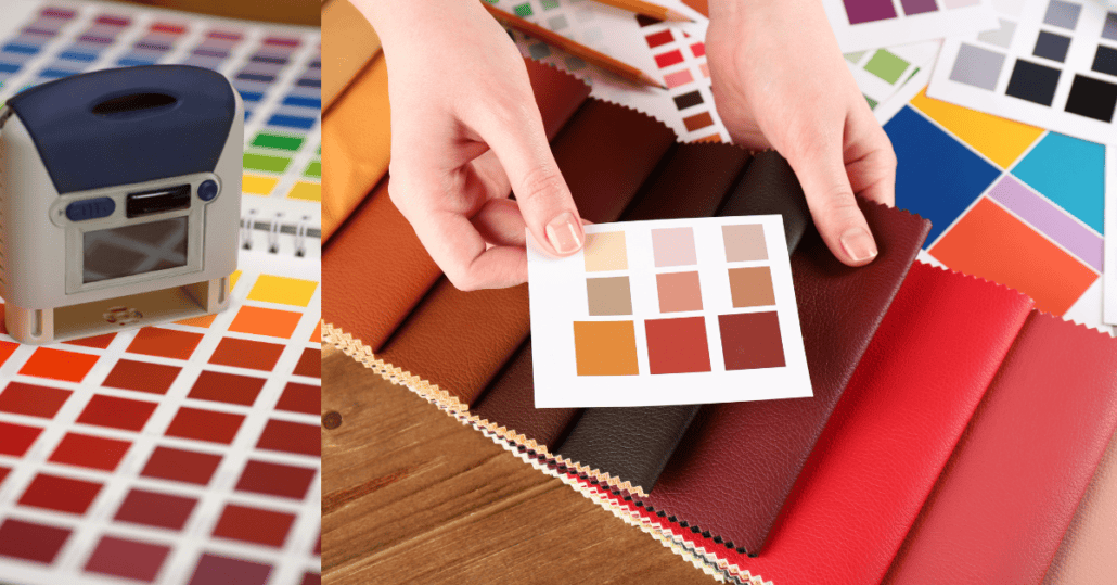
Utilizing Color Matching Tools
Color matching tools are essential for ensuring your custom logo’s colors look great across different mediums. These tools, like color swatches, digital color pickers, and Pantone guides, help you select and match colors accurately.
When you use a color wheel, you can find complementary colors that enhance your design. Additionally, software like Adobe Illustrator offers built-in color-matching features, allowing you to see how your colors will appear on-screen and in print.
Don’t forget to keep a color reference library handy so you can maintain consistency across various projects. By utilizing these tools, you’ll achieve the perfect color harmony that elevates your custom logo and ensures it stands out in any application.
Testing Colors in Different Lighting
Testing your logo’s colors in various lighting conditions is crucial for ensuring they look their best in any environment. Different light sources, like natural sunlight and fluorescent and incandescent bulbs, can dramatically change how colors appear.
To get a true sense of your logo’s colors, examine them in these different settings. Take your sample patches outside to see how they hold up under daylight, then check them under indoor lighting.
Don’t forget to consider the time of day, as natural light can shift throughout the day. Keep a color reference guide handy to compare the patches in each lighting scenario.
Incorporating Brand Identity
Aligning it with your brand identity is essential for effective communication. Your logo should reflect your brand’s values, mission, and personality.
Start by identifying the core elements of your brand: what makes it unique? Use these insights to guide your color choices, shapes, and typography. For example, if your brand promotes sustainability, earthy tones, and organic shapes can convey that message effectively.
Ensure your logo is versatile enough to work across different mediums while maintaining its integrity. Don’t forget to test how your color palette resonates with your target audience; their perception can shape your brand identity.
Ultimately, a well-crafted logo will serve as a powerful visual representation of who you are.
I'm a writer and embroidery enthusiast who is passionate about quality craftsmanship. I feel spiritual to share and review custom made products with a wider audience. I love writing SEO stuff for targeted market.
https://www.patchesmania.com/wp-content/uploads/2025/01/color-match.png6281200Majidhttp://patchesmania.com/wp-content/uploads/2022/07/Patch-Mania-logo-2.pngMajid2025-01-11 04:46:582025-02-10 19:39:06Tips for Perfect Color Matching in Custom Logos for Patches
0replies
Leave a Reply
Want to join the discussion? Feel free to contribute!

Leave a Reply
Want to join the discussion?Feel free to contribute!